Image to Emoji: Complete Guide to Creating Emoji Art
What Is Emoji Mosaic Art?
You've probably seen those impressive images where someone's face or a famous painting is recreated entirely out of emojis. That's emoji mosaic art, and honestly, it's one of the most creative things you can do with these tiny pictograms we use every day.

The concept is simple at its core: take any image, divide it into a grid, and replace each section with an emoji that matches the dominant color or tone of that area. When you step back, all those individual emojis blend together to form a recognizable picture. It's like pointillism, but instead of paint dots, you're using 🔴🟠🟡🟢🔵🟣.
I started playing with emoji mosaics back in early 2024 when I was looking for a unique way to create profile pictures. What began as a quick experiment turned into something I genuinely enjoy. There's something oddly satisfying about watching a photo transform into a colorful grid of familiar symbols.
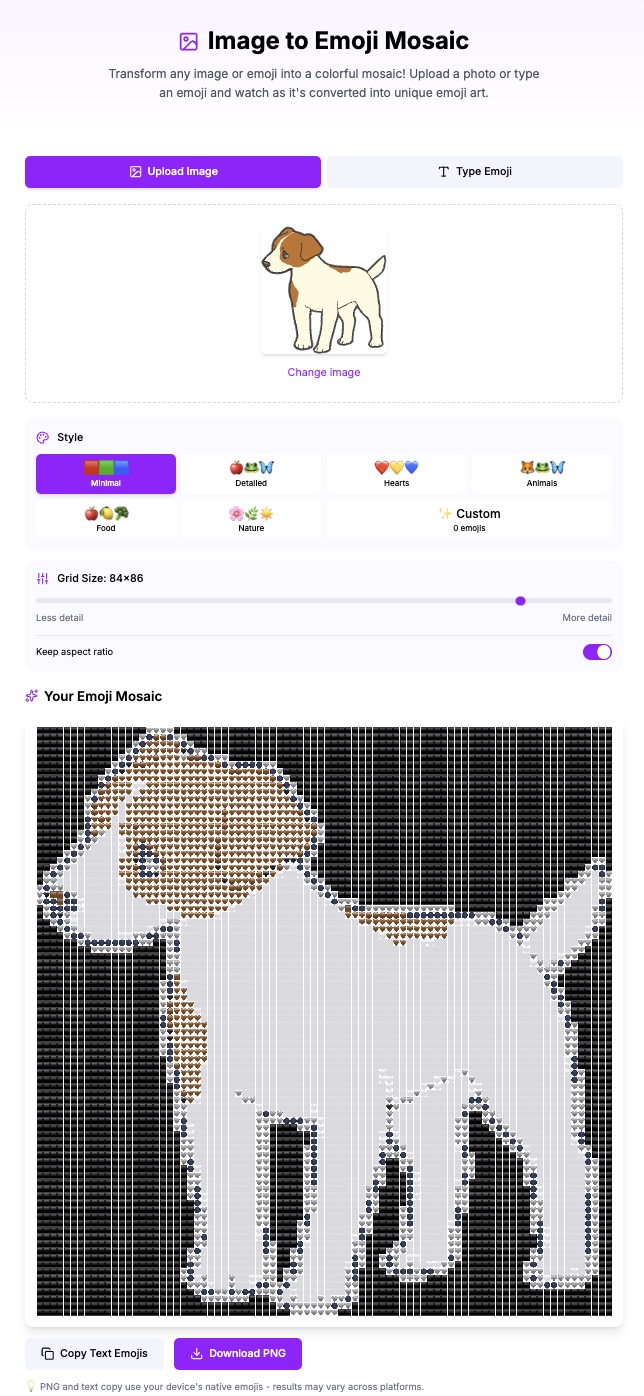
How Our Image to Emoji Tool Works
The tool on emodji.com analyzes your uploaded image pixel by pixel. Here's what happens behind the scenes:
1. Image Analysis: The tool reads the color values of your image and divides it into a grid based on your chosen settings
2. Color Matching: Each grid cell gets analyzed for its dominant color, then matched to the closest emoji in the selected palette
3. Mosaic Generation: The final output is assembled, ready for you to copy and share
The whole process takes just a few seconds, but the algorithm is doing thousands of color comparisons to find the best matches. Different palette options give you different aesthetic results—which brings us to the most important decision you'll make.
Understanding Grid Size: The Foundation of Your Mosaic
Grid size might seem like a minor setting, but it completely changes your result. Here's my breakdown after creating probably hundreds of these things:
Small Grid (20-30 columns)
Best for: Simple icons, logos, profile pictures
When you use a smaller grid, each emoji represents a larger portion of the original image. The result is more abstract but loads faster and works better in places with limited space. I use this setting for Discord profile pictures or when I want something quick for a social media bio.
The trade-off is detail. A human face at 25 columns might look like a blob of skin-tone emojis with some dark spots for eyes. That's not always bad—sometimes the abstract quality is exactly what you want.
Medium Grid (40-60 columns)
Best for: Most photos, general use, balanced detail
I spend most of my time at this setting. A 50-column grid gives you enough resolution to recognize faces and objects while still maintaining that distinct "emoji art" aesthetic. It's the sweet spot where you get detail without overwhelming the viewer with thousands of tiny symbols.
For standard photos—vacation shots, pet pictures, group selfies—start here. You can always adjust up or down based on the result.
Large Grid (80-100+ columns)
Best for: Detailed artwork, large displays, when you want maximum fidelity
At 100 columns, you're pushing into territory where the mosaic almost looks like a regular image at first glance. Only when you zoom in do you realize it's made of emojis. This works great for printing or displaying on large screens.
The downside? File size and loading time. A 100x100 grid means 10,000 emojis. Some platforms struggle with that, and older phones might lag when scrolling past. I reserve large grids for special projects where quality matters more than convenience.
Palette Modes Explained
A note about color palettes: they completely change the mood of your mosaic. Let me walk you through each option.
Minimal Palette
Uses only the most basic colored emojis—hearts, circles, squares. The result is clean and geometric. I like this for abstract art or when the original image has strong, simple color blocks. Logos work particularly well with Minimal.
Colors you'll see: 🔴🟠🟡🟢🔵🟣⚫⚪🟤
Detailed Palette
This expands to include food, nature, objects, and faces. You get much better color matching because there's a wider range of tones available. A sunset photo with Detailed might include 🍊 for orange tones, 🍋 for yellows, and 🍇 for purples alongside the standard colored shapes.
The result looks more varied and interesting at close range. This is my default choice for most photos.
Hearts Palette
Every emoji is a heart. Sounds limiting, but the heart emojis cover a surprising color range: ❤️🧡💛💚💙💜🤎🖤🤍. This creates a distinctive romantic or Valentine's aesthetic. I've used it for anniversary pictures and it hits different—in a good way.
Nature Palette
Restricts emojis to plants, animals, weather, and natural elements. You'll see 🌲🌸🌊🌻🍃 making up your image. Great for outdoor photos or when you want an earthy, organic feel.
Food Palette
Only food and drink emojis. This sounds weird but creates really good results for certain images. The variety of colors in food emojis—from 🍎 reds to 🥬 greens to 🍆 purples—covers most of the spectrum. Plus, there's something amusing about your face being made of sushi and avocados.
Creating Custom Palettes
The tool lets you select exactly which emojis to include in your palette. And that opens the door to some genuinely creative results.
A few custom palette ideas I've tried:
Monochrome Blue: Select only blue-ish emojis (🔵💙🧿🫐🌊🦋). Creates a cyanotype or blueprint effect. Warm Tones Only: Stick to reds, oranges, and yellows (🔴🟠🟡❤️🧡💛🔥☀️🌅). Gives everything a sunset warmth. Just Faces: Use only face emojis (😀😊😐😢😡). The result is chaotic but memorable for the right project. Seasonal: For winter-themed mosaics, I've used ❄️⛄🤍💙🌨️ exclusively.The key is experimentation. I keep a note on my phone with palette combinations that worked well so I can recreate them.
Tips for Getting the Best Results
After a lot of trial and error, here's what I've learned actually matters:
Image Selection
High contrast images work better than flat, evenly-lit photos. The tool needs clear differences in color and brightness to create distinct areas. A photo with dramatic shadows will produce a more interesting mosaic than one taken in soft, diffused light.
Portraits with a clear subject and simple background convert better than busy group shots. When there's too much going on, the emoji mosaic becomes visual noise.
Composition Considerations
The most important parts of your image should fall in the center third of the frame. Edges and corners get cropped or simplified in most display contexts, so put what matters in the middle.
For faces, make sure the eyes are clearly visible and not too small in the original. Eyes are anchor points that help viewers recognize the image as a face. If the eyes are just 2-3 emojis wide, the face becomes unrecognizable.
Color Adjustments Before Upload
Sometimes I bump up the saturation on a photo before converting it. Emojis have vivid, saturated colors, so a washed-out original photo often doesn't match well. A little boost in saturation gives the algorithm better colors to work with.
Similarly, increasing contrast helps. The starker the differences between light and dark areas, the more defined your mosaic will be.
Iterative Refinement
Don't expect perfection on the first try. I usually:
1. Start with default settings to see the baseline
2. Adjust grid size based on the detail level I want
3. Try 2-3 different palettes to see which aesthetic fits
4. Fine-tune from there
It typically takes 3-5 attempts to find the combination that works for a particular image. That's normal—part of the process.
Creative Use Cases
Here's where this tool really shines:
Social Media Profile Pictures
An emoji mosaic profile picture stands out in a sea of regular photos. On Twitter, Discord, or Slack, it's an immediate conversation starter. People notice it, comment on it, ask how you made it.
Gift Art
I've printed emoji mosaics as gifts for friends. A photo of their pet or favorite vacation spot, converted to emojis and printed on canvas, makes a genuinely unique present. Photo printing services like Shutterfly or Canva handle high-resolution exports without issues.
Event Invitations
Wedding invitations, birthday cards, party announcements—embedding an emoji mosaic of the guest of honor or the venue adds a playful, modern touch. It works especially well for milestone birthdays or retro-themed events.
Brand Content
If you run a business account, emoji mosaics of your products or team photos create engaging, shareable content. They perform well on Instagram and LinkedIn because they're visually distinct from typical branded content.
Personal Art Projects
Some people have created entire galleries of emoji art—famous paintings recreated in emojis, cityscapes, abstract compositions. There's a whole community of emoji artists pushing the boundaries of what's possible with this format.
Troubleshooting Common Issues
The Image Looks Like a Blob
Your grid size is probably too small, or the original image lacks contrast. Try increasing the grid to 60+ columns and boosting the contrast on your source image.
Colors Don't Match the Original
This usually happens with unusual colors that don't have close emoji equivalents. Switching to a larger palette (Detailed or custom) gives more options for matching. Some colors—like certain shades of teal or mauve—just don't have good emoji matches. That's a limitation of the medium.
Mosaic Is Too Busy/Chaotic
Two possible causes: either the original image has too much detail, or you're using a palette with too much variety. Simplify one or both. Try a simpler image or switch to a more limited palette like Hearts or Minimal.
Preview Looks Different Than Final Export
Display differences between browsers and devices can affect how emojis render. What looks perfect on your iPhone might shift slightly on Android or desktop. For critical projects, check the export on multiple devices before finalizing.
What's Next?
The Image to Emoji tool keeps evolving. We're exploring animated mosaic support and real-time video conversion—imagine your webcam feed becoming emoji art in real time. But for now, the static image converter handles 99% of what people want to create.
If you haven't tried it yet, start with a simple, high-contrast photo and experiment with different palettes. The learning curve is basically nothing, and you'll have shareable art in under a minute. Once you get the hang of it, you'll find yourself converting random photos just to see how they turn out. That's been my experience, anyway.
Go create something weird and wonderful.
Sources & Further Reading
- Unicode Full Emoji List — official reference from the Unicode Consortium
- Emojipedia — platform comparisons and emoji changelog
- Unicode Consortium — the organization behind the emoji standard
Last updated: February 2026
Written by ACiDek
Creator & Developer
Developer and emoji enthusiast from Czech Republic. Creator of emodji.com, building tools and games that make digital communication more fun since 2024. When not coding, probably testing which emoji combinations work best for different situations.
More articles by ACiDek →Explore Emoji Wiki
Discover detailed meanings, usage examples, and cultural context for popular emoji in our emoji wiki. Each entry includes usage tips, combinations, and platform differences.
Emoji Tools
Put what you learned into practice with our free emoji tools.